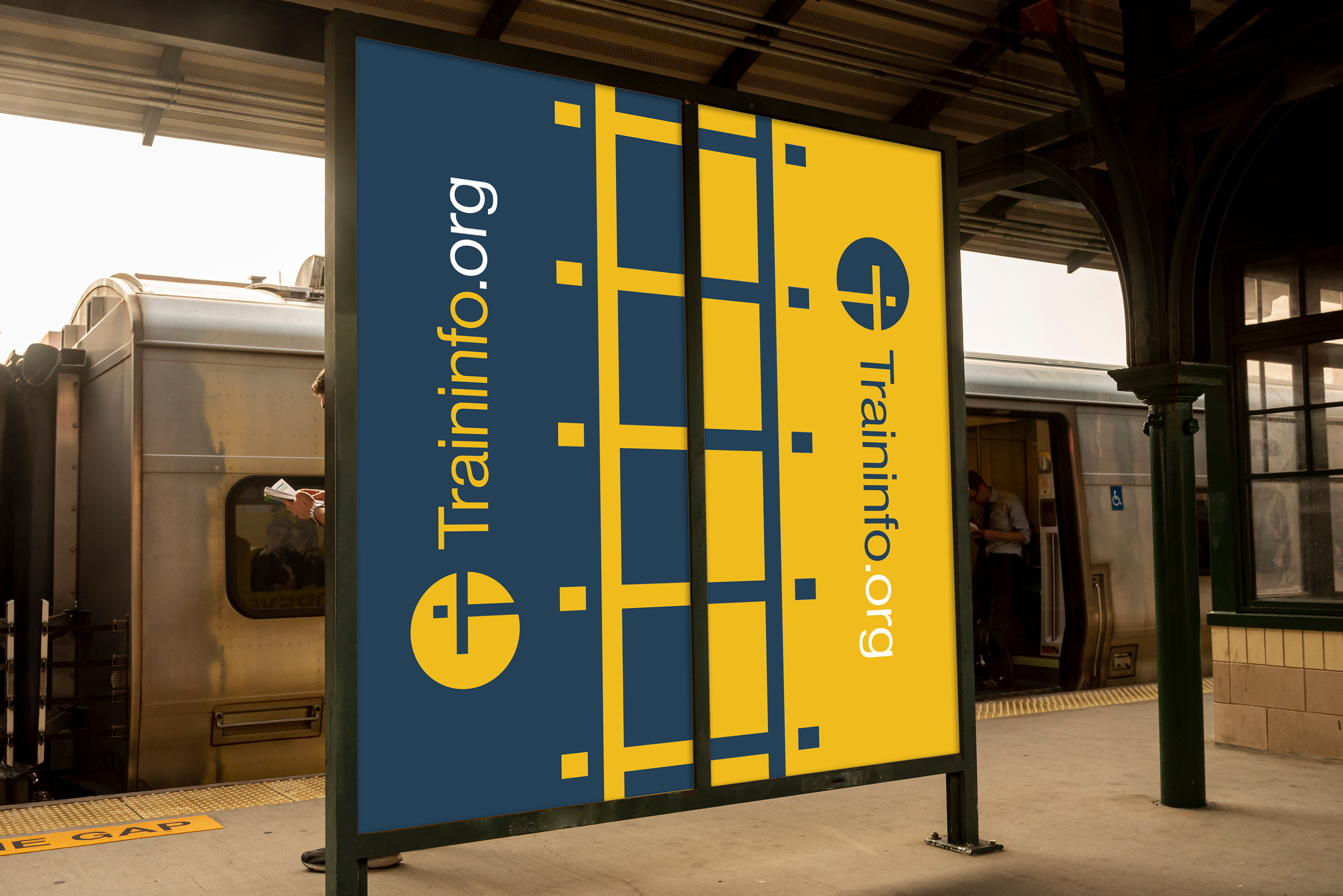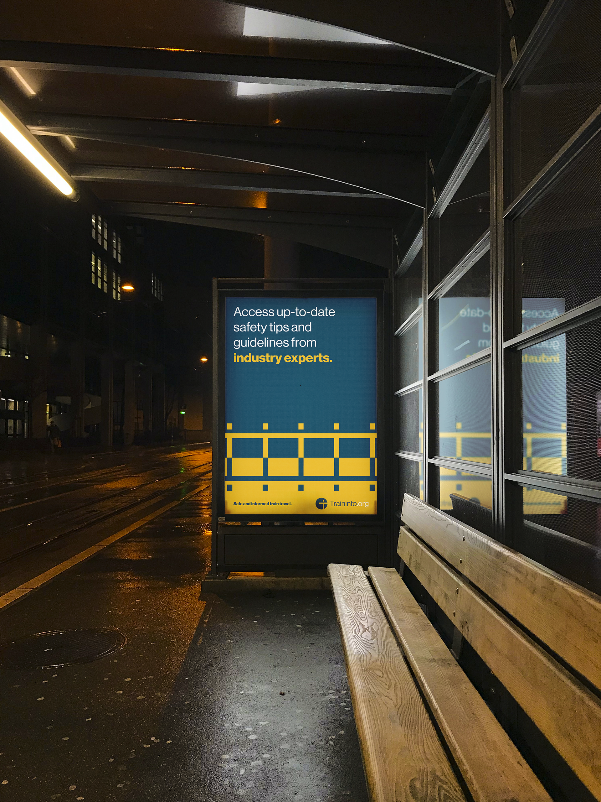
Below is a conceptual visual identity system that I have developed as a passion project for the fictional organization, Traininfo.org. Traininfo.org's mission is to cultivate a safer future by educating people of all ages about helpful train safety practices as well as interesting train-related facts and statistics that can help keep people 'on track'. This initiative reaches people through out-of-home advertising, social media, YouTube content, and a digital app that makes learning fun by gamification.
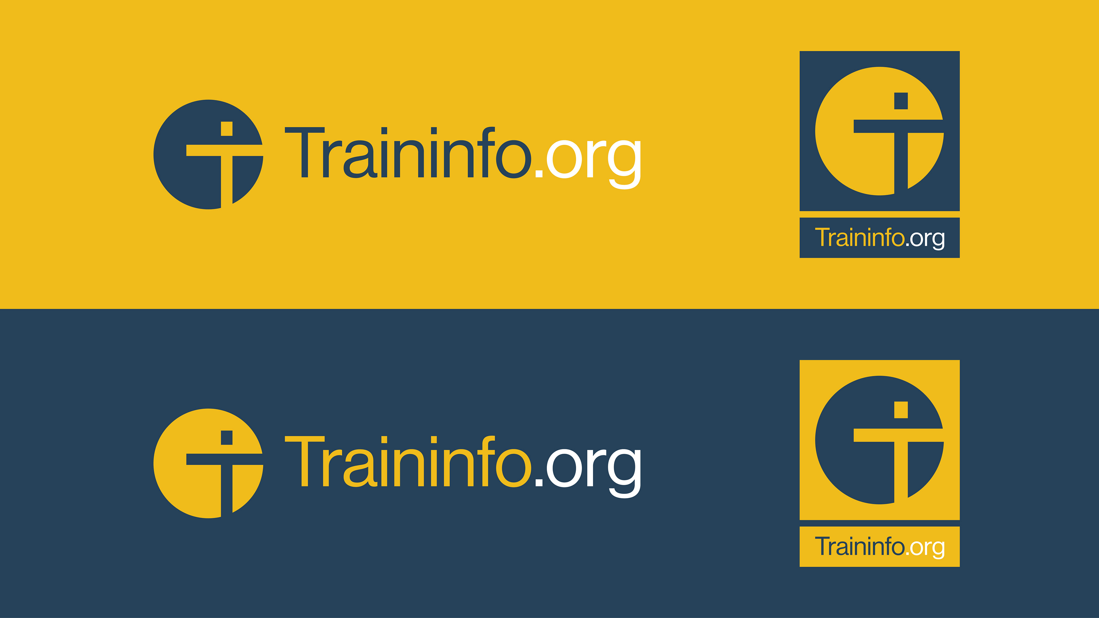
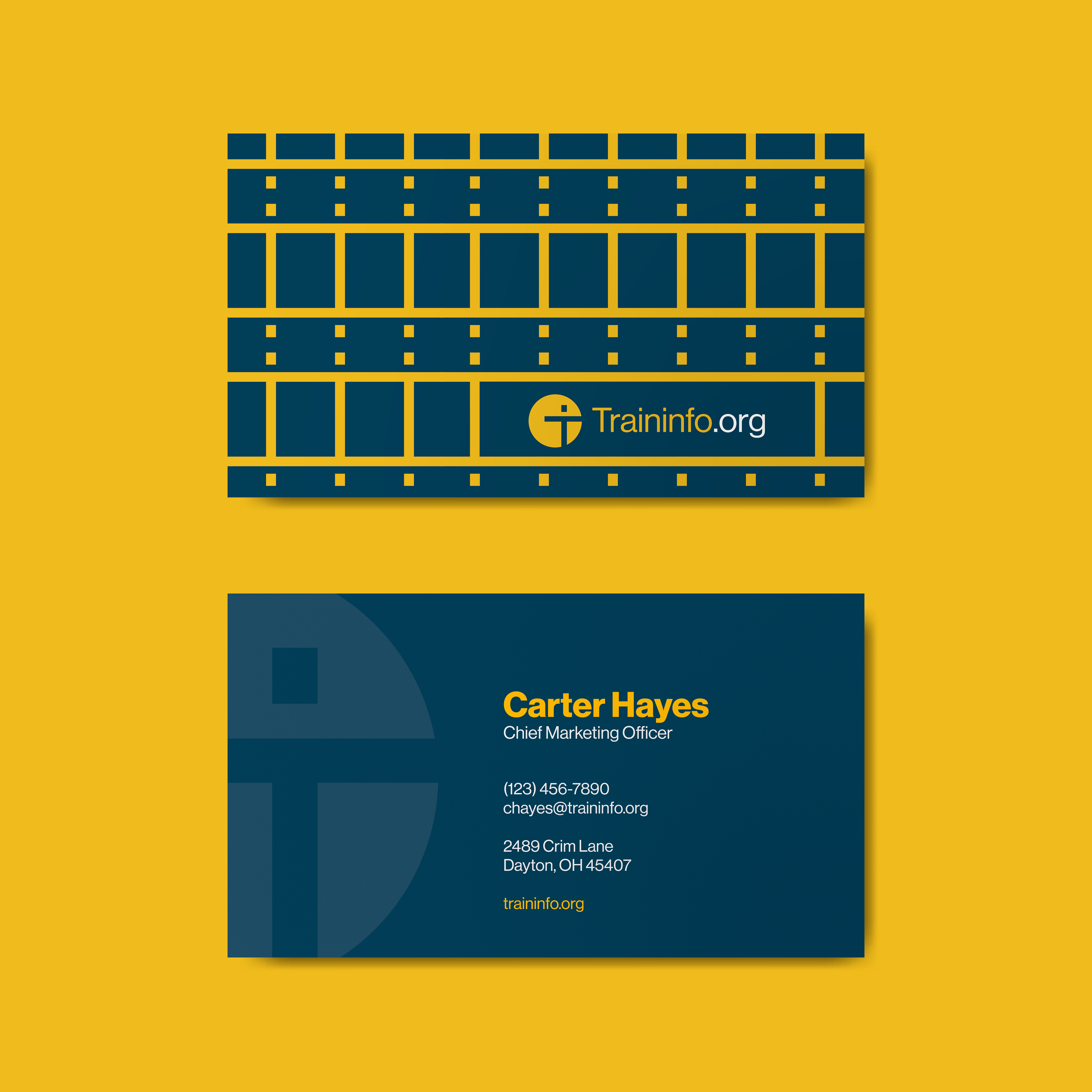
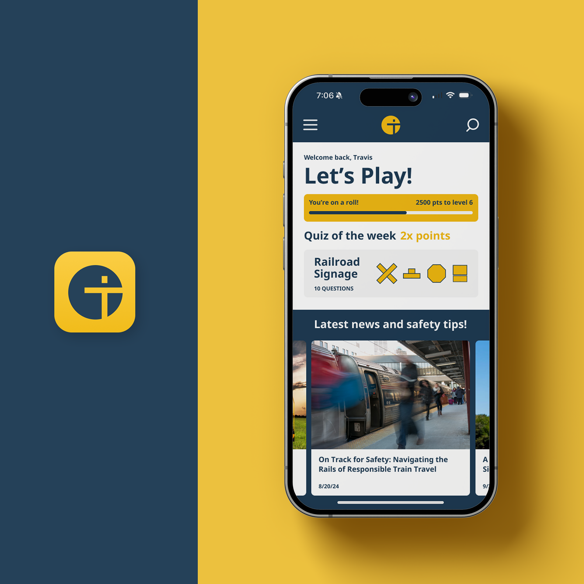
THE LOGO
The identity is kept simple and iconic to help reduce visual clutter that might get in between the viewer and the message. However, the brand has a bit more fun on social platforms and its digital app. The brand icon is a combination of the letters T and I off-centered within a circle. When these two letters are combined, you get a simple depiction of a person, which in this context represents a pedestrian or train passenger. If you repeat this shape over and over, you get something that looks like railroad tracks. I am proud of how much meaning and symbolism is packed into this mark without compromising its simplicity and succinctness.